• For Individuals
  • For Businesses
  • For Universities
  • For Governments
Coursera
  • Online Degrees
  • Careers
  • Log In
  • Join for Free
    Coursera
    • Browse
    • Histogram
    Skip to search results

    Filter by

    Subject
    Required
     *

    Language
    Required
     *

    The language used throughout the course, in both instruction and assessments.

    Learning Product
    Required
     *

    Build job-relevant skills in under 2 hours with hands-on tutorials.
    Learn from top instructors with graded assignments, videos, and discussion forums.
    Learn a new tool or skill in an interactive, hands-on environment.
    Get in-depth knowledge of a subject by completing a series of courses and projects.

    Level
    Required
     *

    Duration
    Required
     *

    Skills
    Required
     *

    Subtitles
    Required
     *

    Educator
    Required
     *

    Results for "histogram"

    • Status: Free Trial
      Free Trial
      D

      Duke University

      Data Visualization with Python

      Skills you'll gain: Data Visualization Software, Data Visualization, Data Storytelling, Interactive Data Visualization, Plotly, Matplotlib, Dashboard, Seaborn, Tableau Software, Scatter Plots, Histogram, Google Sheets, Microsoft Excel, Pandas (Python Package), Data Manipulation

      4.1
      Rating, 4.1 out of 5 stars
      ·
      24 reviews

      Intermediate · Course · 1 - 4 Weeks

    • Status: Free
      Free
      C

      Coursera Project Network

      Data Visualization using Plotly

      Skills you'll gain: Plotly, Exploratory Data Analysis, Scatter Plots, Plot (Graphics), Data Visualization Software, Interactive Data Visualization

      3.9
      Rating, 3.9 out of 5 stars
      ·
      46 reviews

      Intermediate · Guided Project · Less Than 2 Hours

    • U

      Universitat Autònoma de Barcelona

      Detección de objetos

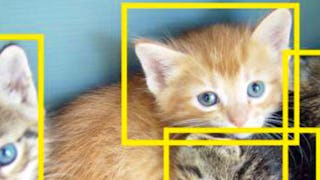
      Skills you'll gain: Computer Vision, Image Analysis, Classification And Regression Tree (CART), Machine Learning Algorithms, Supervised Learning, Machine Learning, Deep Learning, Feature Engineering, Artificial Neural Networks, Histogram

      4.4
      Rating, 4.4 out of 5 stars
      ·
      352 reviews

      Mixed · Course · 1 - 3 Months

    • C

      Coursera Project Network

      Interactive Statistical Data Visualization 101

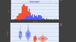
      Skills you'll gain: Plotly, Plot (Graphics), Statistical Visualization, Box Plots, Scatter Plots, Interactive Data Visualization, Data Visualization Software, Histogram

      4.9
      Rating, 4.9 out of 5 stars
      ·
      7 reviews

      Beginner · Guided Project · Less Than 2 Hours

    • Status: Free Trial
      Free Trial
      J

      Johns Hopkins University

      Building Data Visualization Tools

      Skills you'll gain: Ggplot2, Data Visualization Software, Datamaps, Visualization (Computer Graphics), Interactive Data Visualization, Scatter Plots, Histogram, Graphic and Visual Design, R Programming, Geographic Information Systems, Software Development

      3.9
      Rating, 3.9 out of 5 stars
      ·
      158 reviews

      Intermediate · Course · 1 - 3 Months

    • C

      Coursera Project Network

      Time Series Data Visualization And Analysis Techniques

      Skills you'll gain: Time Series Analysis and Forecasting, Data Visualization Software, Statistical Visualization, Plot (Graphics), Box Plots, Anomaly Detection, Heat Maps, Exploratory Data Analysis, Data Processing

      4.4
      Rating, 4.4 out of 5 stars
      ·
      17 reviews

      Intermediate · Guided Project · Less Than 2 Hours

    • Status: Free Trial
      Free Trial
      J

      Johns Hopkins University

      Advanced Data Visualization with R

      Skills you'll gain: Rmarkdown, Tidyverse (R Package), Ggplot2, Spatial Data Analysis, Data Visualization Software, Plot (Graphics), Statistical Visualization, Data Manipulation, Scatter Plots, Plotly, Interactive Data Visualization, R Programming, Data Mapping, Animations

      4.9
      Rating, 4.9 out of 5 stars
      ·
      79 reviews

      Mixed · Course · 1 - 4 Weeks

    • C

      Coursera Project Network

      Data Visualization & Storytelling in Python

      Skills you'll gain: Data Storytelling, Plotly, Data Presentation, Matplotlib, Interactive Data Visualization, Seaborn, Data Visualization, Data Visualization Software, Statistical Visualization, Scatter Plots

      5
      Rating, 5 out of 5 stars
      ·
      6 reviews

      Beginner · Guided Project · Less Than 2 Hours

    • Status: Free Trial
      Free Trial
      J

      Johns Hopkins University

      Data – What It Is, What We Can Do With It

      Skills you'll gain: Data Literacy, Data Analysis, Research Design, Descriptive Statistics, Analytics, Analysis, Statistics, Quantitative Research, Statistical Methods, Probability & Statistics

      4.6
      Rating, 4.6 out of 5 stars
      ·
      174 reviews

      Beginner · Course · 1 - 4 Weeks

    • Status: Free Trial
      Free Trial
      U

      University of Colorado Boulder

      Fundamentals of Data Visualization

      Skills you'll gain: Data Visualization Software, Interactive Data Visualization, Visualization (Computer Graphics), User Centered Design, Statistical Visualization, Data Presentation, Usability, Data Storytelling, Human Computer Interaction, User Research, Usability Testing, Requirements Analysis, Design Elements And Principles

      Build toward a degree

      4.8
      Rating, 4.8 out of 5 stars
      ·
      36 reviews

      Intermediate · Course · 1 - 4 Weeks

    • Status: Free Trial
      Free Trial
      C

      Codio

      Data Science and Analysis Tools - from Jupyter to R Markdown

      Skills you'll gain: Rmarkdown, Plot (Graphics), Box Plots, Descriptive Statistics, Scatter Plots, Histogram, Jupyter, Matplotlib, Data Presentation, Ggplot2, Statistical Visualization, Statistical Hypothesis Testing, Correlation Analysis, Data Visualization Software, Dashboard, Tidyverse (R Package), Data Analysis, Interactive Data Visualization, Data Import/Export, Data Visualization

      3.9
      Rating, 3.9 out of 5 stars
      ·
      22 reviews

      Beginner · Specialization · 3 - 6 Months

    • C

      Coursera Project Network

      Plots Creation using Matplotlib Python

      Skills you'll gain: Matplotlib, Box Plots, Plot (Graphics), Seaborn, Data Visualization Software, Pandas (Python Package), Scatter Plots, Data Presentation, Data Import/Export, Histogram, Python Programming, Data Manipulation, Data Structures

      3.9
      Rating, 3.9 out of 5 stars
      ·
      9 reviews

      Beginner · Guided Project · Less Than 2 Hours

    1…678…13

    In summary, here are 10 of our most popular histogram courses

    • Data Visualization with Python: Duke University
    • Data Visualization using Plotly: Coursera Project Network
    • Detección de objetos: Universitat Autònoma de Barcelona
    • Interactive Statistical Data Visualization 101: Coursera Project Network
    • Building Data Visualization Tools: Johns Hopkins University
    • Time Series Data Visualization And Analysis Techniques : Coursera Project Network
    • Advanced Data Visualization with R: Johns Hopkins University
    • Data Visualization & Storytelling in Python: Coursera Project Network
    • Data – What It Is, What We Can Do With It: Johns Hopkins University
    • Fundamentals of Data Visualization: University of Colorado Boulder

    Other topics to explore

    Arts and Humanities
    338 courses
    Business
    1095 courses
    Computer Science
    668 courses
    Data Science
    425 courses
    Information Technology
    145 courses
    Health
    471 courses
    Math and Logic
    70 courses
    Personal Development
    137 courses
    Physical Science and Engineering
    413 courses
    Social Sciences
    401 courses
    Language Learning
    150 courses

    Coursera Footer

    Technical Skills

    • ChatGPT
    • Coding
    • Computer Science
    • Cybersecurity
    • DevOps
    • Ethical Hacking
    • Generative AI
    • Java Programming
    • Python
    • Web Development

    Analytical Skills

    • Artificial Intelligence
    • Big Data
    • Business Analysis
    • Data Analytics
    • Data Science
    • Financial Modeling
    • Machine Learning
    • Microsoft Excel
    • Microsoft Power BI
    • SQL

    Business Skills

    • Accounting
    • Digital Marketing
    • E-commerce
    • Finance
    • Google
    • Graphic Design
    • IBM
    • Marketing
    • Project Management
    • Social Media Marketing

    Career Resources

    • Essential IT Certifications
    • High-Income Skills to Learn
    • How to Get a PMP Certification
    • How to Learn Artificial Intelligence
    • Popular Cybersecurity Certifications
    • Popular Data Analytics Certifications
    • What Does a Data Analyst Do?
    • Career Development Resources
    • Career Aptitude Test
    • Share your Coursera Learning Story

    Coursera

    • About
    • What We Offer
    • Leadership
    • Careers
    • Catalog
    • Coursera Plus
    • Professional Certificates
    • MasterTrack® Certificates
    • Degrees
    • For Enterprise
    • For Government
    • For Campus
    • Become a Partner
    • Social Impact
    • Free Courses
    • ECTS Credit Recommendations

    Community

    • Learners
    • Partners
    • Beta Testers
    • Blog
    • The Coursera Podcast
    • Tech Blog
    • Teaching Center

    More

    • Press
    • Investors
    • Terms
    • Privacy
    • Help
    • Accessibility
    • Contact
    • Articles
    • Directory
    • Affiliates
    • Modern Slavery Statement
    • Manage Cookie Preferences
    Learn Anywhere
    Download on the App Store
    Get it on Google Play
    Logo of Certified B Corporation
    © 2025 Coursera Inc. All rights reserved.
    • Coursera Facebook
    • Coursera Linkedin
    • Coursera Twitter
    • Coursera YouTube
    • Coursera Instagram
    • Coursera TikTok